Colorful Identities while choosing the exhibition stand color, delves into the intricate world of branding, exploring the profound meanings and associations that different colors convey. From the warmth of red to the tranquility of blue, this exploration unravels the psychology behind color choices in branding, revealing how businesses strategically leverage hues to evoke emotions, communicate values, and establish a distinct and memorable brand identity.
What does different colors mean in branding?
while choosing the exhibition stand color, Colorful Identities provides a comprehensive exploration of the nuanced meanings and strategic applications of different colors in branding. From conveying dynamism and stability to sophistication and joy, the chosen color palette becomes a powerful tool for businesses to communicate their values, evoke emotions, and establish a unique and enduring brand identity in the minds of consumers.
Passionate Reds and Energetic Oranges
Explore the vibrant spectrum of “Passionate Reds and Energetic Oranges,” where warm tones convey dynamism and excitement. This section unravels how brands strategically use these colors to evoke a sense of energy, passion, and enthusiasm, creating a visually compelling identity that resonates with consumers.
Tranquil Blues and Calming Greens
Delve into the soothing realm of “Tranquil Blues and Calming Greens,” where cool tones evoke feelings of trust and stability. This component explores how brands leverage these colors to establish a sense of reliability, trustworthiness, and a calm, serene identity that fosters confidence among consumers.
Elegant Purples and Luxurious Black
Uncover the world of “Elegant Purples and Luxurious Blacks,” where regal tones symbolize sophistication and prestige. This section explores how brands use these colors to convey a sense of exclusivity, luxury, and refinement, creating an identity that exudes opulence and attracts a discerning audience. you can easily choose elegant purples as exhibition stand color to promote your brand.
Cheerful Yellows and Optimistic Oranges
“Cheerful Yellows and Optimistic Oranges” illuminate the spectrum of positivity and joy. This component unravels how brands employ these warm and vibrant hues to communicate optimism, friendliness, and a sunny disposition, creating a brand identity that resonates with a positive and uplifting vibe.
the branding of the exhibition stand
Balancing Neutrals
Explore the harmonious world of “Balancing Neutrals,” where whites, grays, and browns convey a sense of simplicity, serenity, and timelessness. This section discusses how brands use neutral tones to create a clean, versatile identity that exudes simplicity, reliability, and a timeless appeal.
Harmonizing Hues
“Harmonizing Hues” delves into the art of crafting a unified brand palette. This component explores how brands strategically choose a combination of colors to create a cohesive and harmonious identity. Discover how the thoughtful integration of exhibition stand color contributes to a distinct and memorable brand image.
Cultural Symbolism
Explore “Cultural Symbolism” as this section delves into how color meanings vary across different geographies and cultures. Brands must navigate cultural nuances to ensure that the chosen colors align with local perceptions, beliefs, and preferences, creating a culturally resonant brand identity.
Evoking Emotions
“Evoking Emotions” uncovers the psychology behind color choices in branding. This component explores how each color elicits specific emotional responses and how brands strategically leverage these emotional triggers to create a powerful and memorable connection with their target audience.
The role of exhibition stand color in attracting customers’ attention
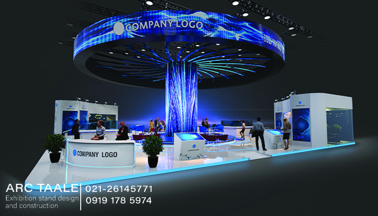
“Hues of Attraction” illuminates the strategic role of exhibition stand color in capturing customer attention. From the psychology of color to the use of vibrant and calming tones, the right color palette becomes a powerful tool for exhibitors to create visual impact, establish a memorable presence, and draw in attendees with a compelling and inviting booth experience.
Hues of Attraction
“Hues of Attraction” unravels the significance of exhibition stand color and how they play a pivotal role in capturing the attention of customers. From vibrant reds that convey energy to calming blues that evoke trust, this exploration delves into the psychology of color and its strategic application, revealing how the right color palette can be a powerful tool for exhibitors to stand out, create visual impact, and draw in curious attendees.
Color Psychology Unleashed
Explore the captivating world of “Color Psychology Unleashed,” where the chosen hues in an exhibition booth become a form of visual communication. This section delves into the emotional and psychological impact of colors, unveiling how they can influence customer perceptions, moods, and engagement levels.
Creating Visual Impact with Unique Colors
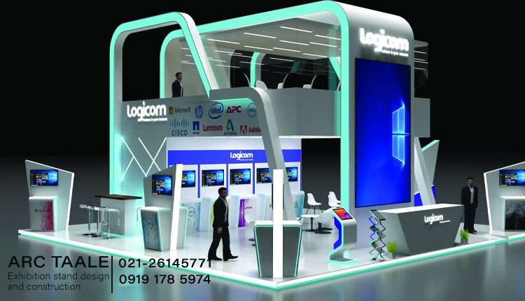
“Stand Out in the Crowd” emphasizes the importance of choosing unique and distinctive exhibition stand color that set the booth apart. This component explores how unconventional color choices can create visual impact, making the booth memorable amidst a sea of exhibition spaces and enticing attendees to explore further.
Harmony in Diversity
Explore the concept of “Harmony in Diversity,” where exhibitors strategically craft a cohesive color palette. This section delves into how a well-balanced and harmonious blend of colors contributes to a visually appealing and unified booth design, creating a seamless and inviting environment for customers.
Versatility in Neutrals
“Versatility in Neutrals” uncovers the timeless elegance of neutral exhibition stand color. This component explores how whites, grays, and browns provide a versatile backdrop, allowing exhibitors to showcase products and messages with clarity while maintaining a sense of sophistication and timelessness.
Cultural Sensitivity
Delve into “Cultural Sensitivity” as this section explores the importance of adapting colors to resonate across diverse audiences. Exhibitors must navigate cultural nuances to ensure that the chosen colors align with local perceptions and preferences, fostering a connection with a broader range of attendees.
From Aisle to Attraction
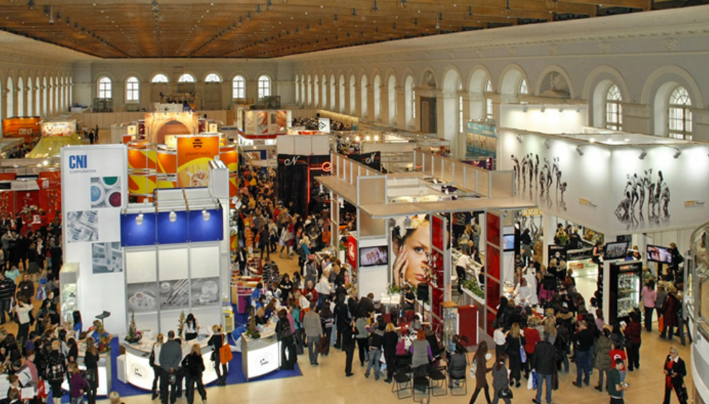
“From Aisle to Attraction” emphasizes the strategic placement of colors to guide attendees. This component explores how color placement can act as a visual cue, directing the flow of foot traffic and guiding attendees through a carefully curated journey of engagement within the exhibition booth.
Conscious selection of colors in booth design to promote branding
Chromatic Harmony illuminates the strategic and conscious selection of exhibition stand color as a powerful tool for promoting branding. From aligning with brand identity and values to eliciting emotional responses, ensuring consistency across mediums, creating standout signatures, cultural fluency, strategic color placement, and leaving memorable impressions, the palette becomes an integral aspect of crafting a visually compelling and authentic brand presence within the exhibition space.
Color as a Brand Ambassador
Delve into the concept of “Color as a Brand Ambassador,” where the chosen palette becomes a visual representation of the brand identity. This section explores how colors serve as silent ambassadors, communicating the values, personality, and essence of the brand to booth visitors, creating an immediate and memorable connection.
Brand DNA in Hues
“Brand DNA in Hues” delves into the alignment of exhibition stand color with the core identity and values of the brand. This component explores how conscious color selection ensures that the booth design reflects the essence of the brand, fostering a cohesive and authentic representation that resonates with the intended audience.
Emotional Resonance
Explore the realm of “Emotional Resonance,” where color psychology becomes a guiding principle in booth design. This section unravels how specific colors are chosen to elicit emotional responses, whether it be excitement, trust, or joy, creating an immersive brand experience that engages attendees on a deeper level.
Consistency Across Mediums
“Consistency Across Mediums” emphasizes the importance of harmonizing exhibition stand color across various brand communication channels. This component explores how a unified color palette ensures consistency in visual branding, whether in booth design, marketing materials, or digital presence, reinforcing brand recognition and recall.
Standout Signatures
“Standout Signatures” highlights the creation of unique visual brand signifiers through color selection. This section explores how certain colors can become synonymous with a brand, acting as distinctive markers that set the brand apart in a competitive landscape, fostering instant recognition among attendees.
Strategic Color Placement
“Strategic Color Placement” emphasizes the deliberate use of color to guide attention and interaction within the booth. This component explores how color placement serves as a visual cue, directing attendees through the booth journey, highlighting key areas, and creating a seamless and engaging brand experience.
how to choose the best color for my booth
ColorCraft provides exhibitors with a roadmap for choosing the best exhibition stand color, considering the nuances of color psychology, brand alignment, visual distinctiveness, versatility, cohesive harmony, strategic placement, cultural adaptation, and the iterative process. By mastering the art of color selection, exhibitors can craft a booth that not only attracts attention but also leaves a lasting and positive impression on attendees.
Understanding Color Psychology
Delve into the art of “Understanding Color Psychology,” where the guide begins by exploring the emotional and psychological impact of different colors. Learn how specific hues evoke distinct feelings and reactions, allowing exhibitors to strategically choose colors that align with the desired mood and atmosphere for their booth.
Reflecting Brand Essence
“Reflecting Brand Essence” emphasizes the importance of choosing exhibition stand color in harmony with your brand identity. This section guides exhibitors in aligning booth colors with brand values, personality, and messaging, ensuring that the chosen palette becomes a genuine and authentic representation of the brand.
Standing Out in Style
Explore the art of “Standing Out in Style” by choosing unique and memorable hues. This component highlights the significance of selecting colors that differentiate your booth from others, creating a visually distinctive presence that lingers in the minds of attendees long after the exhibition concludes.
Versatility in Neutrals
“Versatility in Neutrals” uncovers the timeless elegance of neutral exhibition stand color. Discover how whites, grays, and browns provide a versatile canvas for creativity, allowing exhibitors to showcase products and messaging with clarity while maintaining a sense of sophistication and timelessness.
Cohesive Harmony
“Cohesive Harmony” delves into the art of blending colors for visual appeal. This section guides exhibitors in creating a cohesive color palette that harmonizes with the overall booth design, fostering a visually pleasing environment that enhances attendee engagement.
Guiding Attention
Uncover the importance of “Guiding Attention” through strategic exhibition stand color placement. This component explores how color can be strategically used to guide attendees through the booth journey, highlight key areas, and create a seamless and engaging experience.
Adapting to Culture
“Adapting to Culture” explores the art of choosing colors for global appeal. Exhibitors navigate diverse cultural preferences to ensure that the selected colors resonate positively across different regions, fostering a universal connection with a diverse audience.