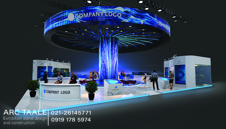
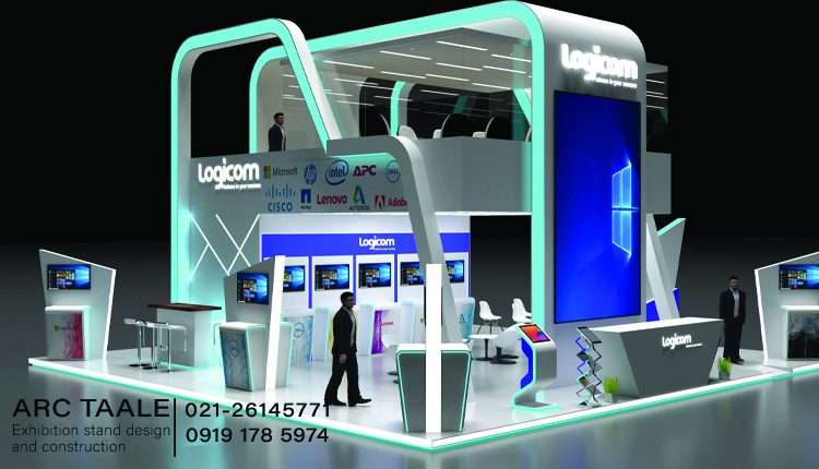
The choice of industrial booth color is more than just an aesthetic decision; it’s a strategic element that profoundly influences the overall impact and success of an exhibition presence. This exploration delves into the significance of color selection in booth construction and its far-reaching effects on brand perception and visitor engagement.
The importance of color selection in booth construction
the importance of industrial booth color selection goes beyond aesthetics; it is a strategic tool for communicating brand identity, shaping visitor experiences, and leaving a lasting impression in the competitive landscape of exhibitions and events.
Brand Identity Reinforcement
the industrial exhibition stand color palette should harmonize seamlessly with the brand’s identity. Consistency in color reinforces brand recognition, creating a visual link between the booth and the broader brand image. This cohesion is crucial for leaving a lasting imprint on visitors.
Emotional Resonance and Atmosphere
Colors evoke emotions, and the right palette can set the desired atmosphere within the booth. Warm tones like reds and oranges can create a vibrant and energetic ambiance, while cooler blues and greens may convey a sense of calm and professionalism. Understanding the emotional impact of colors is key to shaping visitor perceptions.
Attention Grabbing and Visibility
Certain colors naturally draw more attention than others. Bold and vibrant hues can make a booth stand out in a crowded exhibition hall, increasing visibility and attracting visitors. The strategic use of contrasting colors for industrial booth color can guide attention to specific areas or focal points within the booth.
Branding Differentiation
In a sea of booths, a well-selected color scheme can serve as a distinctive marker, setting a brand apart from competitors. The uniqueness of the booth’s colors contributes to its memorability and helps in forging a distinct identity in the minds of attendees.
Readability of Messaging
Legibility is paramount when conveying messages through text or graphics. The contrast between text and background colors should be carefully considered to ensure that information is easily readable from a distance. This is especially crucial in high-traffic exhibition environments.
Visual Harmony and Balance
A thoughtfully chosen industrial booth color palette contributes to visual harmony and balance within the booth. Avoiding clashing or overly busy combinations ensures that the overall aesthetic is pleasing to the eye and allows visitors to focus on the intended messaging and displays.
Suggested article: Professional Perfume Exhibition Stand Design
The concept of various colors for brand selection
In the intricate realm of brand selection, the choice of industrial booth color transcends mere visual appeal; it becomes a powerful means of communication, conveying the essence of a brand and forging a deep connection with its audience. This exploration delves into the concept of leveraging various colors in brand selection, unraveling the psychology and strategic implications behind each hue.
Red: The Dynamic Force
Red, a color synonymous with energy and passion, signifies strength and action. Brands opting for red in their palette often aim to evoke excitement, urgency, and a sense of dynamism. It’s a choice that commands attention and fosters a bold brand identity. Red is a common color used for industrial brands and its suitable for industrial booth color selection.
Blue: Trust and Tranquility
Blue, a hue associated with trust and stability, is a popular choice for brands seeking to convey reliability and professionalism. Whether in corporate logos or product packaging, blue instills a sense of calmness and trustworthiness, making it a versatile and widely embraced color.
Green: Harmony and Growth
Green symbolizes nature, growth, and balance. Brands incorporating green into their identity often aim to communicate sustainability, freshness, and a commitment to environmental values. It resonates with audiences seeking products or services aligned with a sense of well-being.
Yellow: Optimism and Positivity
Yellow exudes optimism and positivity, making it an ideal choice for brands looking to convey a vibrant and cheerful image. Associated with sunshine and warmth, yellow can inject a sense of joy and approachability into a brand’s visual identity. Yellow is also a common choice for industrial booth color.
Purple: Elegance and Luxury
Purple, historically linked to royalty, conveys a sense of luxury, sophistication, and creativity. Brands utilizing purple in their color scheme often seek to position themselves as premium, innovative, and distinctive within their market.
Orange: Energy and Playfulness
Orange combines the energy of red with the warmth of yellow, creating a color that radiates enthusiasm and playfulness. Brands incorporating orange seek to stand out, appeal to a youthful demographic, and communicate a sense of fun and approachability.
Black: Timeless Elegance
Black is a classic choice synonymous with sophistication, luxury, and timelessness. Brands leveraging black in their design often aim to project a sense of elegance, prestige, and a commitment to enduring quality.
Pink: Femininity and Compassion
Pink, often associated with femininity, communicates qualities of compassion, warmth, and sensitivity. Brands incorporating pink may target audiences seeking products or services aligned with a nurturing and empathetic ethos.
Brown: Earthiness and Reliability
Brown, reminiscent of earth and natural elements, conveys reliability, warmth, and a down-to-earth sensibility. Brands utilizing brown seek to establish a connection with authenticity, stability, and a sense of grounded trust.
Gray: Neutrality and Modernity
Gray, a neutral tone, exudes sophistication and modernity and is a suitable option for industrial booth color . Brands incorporating gray into their identity convey a sense of balance, professionalism, and a commitment to timeless design.
Suitable color for industrial brands
In the industrial sector, the industrial booth color selection goes beyond aesthetics; it becomes a language through which brands convey their core values, reliability, and commitment to excellence. The strategic use of suitable colors enables industrial brands to not only capture attention but also instill confidence in their capabilities and contribute to a memorable and impactful visual identity.
industrial Hues
In the realm of industrial branding, the choice of color is not merely a visual preference but a strategic decision that communicates strength, reliability, and a commitment to precision. This exploration delves into the concept of selecting suitable colors for industrial brands, offering insights into hues that resonate with the robust and dependable nature of the sector.
Strategic Steel Gray
Steel gray, with its industrial undertones, serves as a foundational color for industrial booth color selection. Reflecting the strength of steel structures, this hue conveys a sense of robustness, durability, and unwavering reliability. Brands in heavy machinery, manufacturing, and construction often find that steel gray forms the backbone of a powerful visual identity, projecting a steadfast commitment to quality.
Bold Machinery Yellow
Bold machinery yellow injects vibrancy and visibility into the industrial palette. Often associated with heavy equipment and construction machinery, this color choice communicates energy, dynamism, and a strong presence on worksites. Industrial brands utilizing machinery yellow send a clear message of vitality, innovation, and a forward-thinking approach within the sector.
Safety Orange
Safety orange, a high-visibility hue, holds particular relevance in industrial settings where safety is paramount. Commonly associated with warning signs and safety gear, this color choice communicates a commitment to worker well-being, caution, and adherence to industry standards. It serves as a visual cue for safety-conscious industrial brands, fostering trust among employees and clients alike.
Innovative Metallics
Innovative metallic tones, such as silver, chrome, or brushed steel, contribute to industrial booth color’s futuristic identity. These modern hues symbolize innovation, cutting-edge technology, and a commitment to progress. Metallic elements strategically integrated into booth construction enhance the overall aesthetic, positioning the industrial brand as a leader in forward-thinking solutions.
This comprehensive industrial exhibition stand color selection guide serves as a blueprint for industrial booth construction, offering a nuanced understanding of how color choices can harmonize with the values of the sector.

