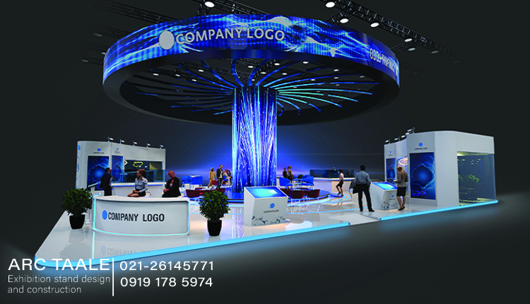
Selecting suitable colors for Painting an Exhibition Stand requires a thoughtful and strategic approach. By considering brand identity, contrast, target audience, trends, brand message, stand size, lighting, competition, and flexibility, exhibitors can create a visually appealing and effective display that leaves a lasting impression on visitors.
Which colors are suitable for an exhibition stand?
When designing an exhibition stand, selecting the right colors is a crucial aspect that can significantly impact the overall success of the display. The color scheme chosen not only affects the visual appeal but also communicates the brand identity and message. Here’s a breakdown of considerations and recommendations for selecting suitable colors for an exhibition stand:
Brand Identity and Consistency
Start by incorporating the primary colors of the brand to ensure consistency with the overall brand identity. This helps in creating a cohesive and recognizable presence at the exhibition.
Contrast and Visibility
Opt for colors that provide high contrast to make key elements, such as logos and important information, easily visible from a distance. This ensures that the stand stands out in a crowded exhibition space.
Target Audience
Consider the demographics of the target audience. Colors can evoke specific emotions and resonate differently with various age groups and cultural backgrounds. Tailor the color palette to appeal to the preferences of the target audience.
Trends and Industry Standards
Stay informed about current design trends within the industry. While it’s essential to be on-trend, make sure the selected colors align with the brand’s identity and message.
Brand Message
Colors can evoke emotions and convey messages. Choose colors that align with the desired emotional response or message the brand wants to communicate. For example, blue may convey trust and professionalism, while red may evoke energy and excitement.
Stand Size and Layout
Use colors strategically to create optical illusions that enhance the perception of the stand’s size. Lighter colors can make a smaller stand feel more spacious, while darker colors can add a sense of intimacy to a larger space.
Lighting Considerations
Keep in mind the lighting conditions of the exhibition venue. Some colors may appear differently under various lighting setups. Choose colors that look appealing both under artificial and natural lighting.
Competitor Analysis
Analyze the color schemes used by competitors. Strive for a distinctive palette that sets the brand apart while still adhering to the overall industry aesthetic.
Test and Iterate
Before finalizing the color scheme, create mock-ups or samples to visualize how the colors will look in the actual exhibition environment. This allows for adjustments and ensures a polished final presentation.
Flexibility for Reusability
Choose colors that can be easily incorporated into other marketing materials and future exhibitions. This ensures a consistent and recognizable brand presence across various platforms.
read more
How to paint your exhibition stand?
When it comes to creating an eye-catching and visually appealing exhibition stand, painting plays a crucial role. Properly executed painting enhances the overall aesthetics, communicates the brand message, and attracts the attention of the audience. Here’s a comprehensive guide on how to paint your exhibition stand:
Preparation and Planning
Before starting, evaluate the surface of the exhibition stand. Ensure it is clean, smooth, and free from any debris or imperfections. Sanding or priming may be necessary for optimal paint adherence.
Gather Necessary Supplies
Purchase the required amount of paint and primer based on the size of the exhibition stand. Ensure that the primer is compatible with both the surface material and the chosen paint.
Color Sampling
Before applying paint to the entire stand, test a small section with the chosen colors. This allows for adjustments and ensures that the final result aligns with the intended vision.
Priming the Surface
Begin by applying a suitable primer to the entire surface. Primer enhances paint adhesion, promotes an even finish, and improves durability. Allow the primer to dry completely before moving on to the painting stage.
Painting Techniques
Choose the painting technique based on the size and intricacy of the stand. Brushes are suitable for detailed work, while rollers are efficient for larger areas. Spray painting can provide a smooth and even finish but requires careful masking to avoid overspray.
Detailing and Branding
Use the painting process to incorporate brand logos, graphics, and any other visual elements that reinforce the brand identity. Precision is key when detailing these elements.
Drying and Curing
After completing the painting, allow sufficient time for the paint to dry completely. Rushing this step can lead to smudges or damage to the finish.
Final Inspection
Conduct a thorough inspection of the painted surface. Look for any imperfections, drips, or uneven areas. Touch up as needed to ensure a flawless finish.
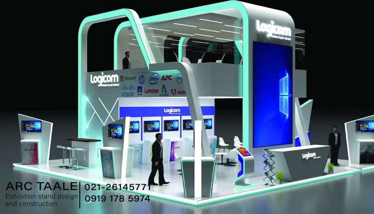
The art of color combination for coloring an exhibition stand.
Selecting the right color combination for an exhibition stand is a nuanced process that requires careful consideration of various factors. A harmonious color scheme not only enhances the visual appeal of the stand but also communicates the brand identity effectively. Here’s a detailed guide on mastering the art of color combination for coloring an exhibition stand:
Understand Brand Identity
Begin by identifying the brand’s primary colors. These are the hues that represent the essence of the brand and should be incorporated prominently into the color scheme to maintain consistency and brand recognition.
Consider the Color Wheel
Explore analogous color schemes, which involve selecting colors that are adjacent to each other on the color wheel. This creates a cohesive and unified look while allowing for subtle variations.
Account for Contrast
Ensure that key elements, such as logos and important information, have high contrast against the background. This enhances visibility and ensures that crucial details are easily discernible from a distance.
Understand Color Psychology
Recognize the emotional impact of different colors. Warm tones like red and orange can evoke energy and excitement, while cool tones like blue and green may convey calmness and trust. Tailor the color palette to align with the desired emotional response.
Size and Layout Optimization
Use color to create the illusion of depth and dimension within the stand. Lighter colors can make a space feel more open, while darker colors can add intimacy. Consider the size and layout of the stand when choosing colors.
Experiment with Textures and Materials
If the exhibition stand includes various textures and materials, consider how colors interact with these elements. The interplay of colors and textures can add depth and visual interest.
Adaptability for Different Lighting Conditions
Exhibition spaces often have diverse lighting conditions. Test the selected color combination under different lighting sources to ensure that the colors appear as intended. Adjustments may be necessary for optimal visibility.
Test and Iterate
Before finalizing the color combination, create samples or mock-ups of the exhibition stand. This allows for visualizing how the colors interact and provides an opportunity to make adjustments for the most impactful result.
Brand Messaging Integration
Utilize colors as a part of the visual storytelling process. Ensure that the chosen color combination aligns with the brand message and narrative being communicated through the exhibition stand.
By following these guidelines, exhibitors can master the art of color combination, creating exhibition stands that not only catch the eye but also effectively convey the brand identity and message to the target audience.